I am a bit obsessed with Susan Kare’s original 1984 Macintosh bitmap fonts and design and made my own Truetype version of her great Chicago font using BitFontMaker.
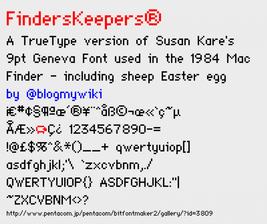
I then got intrigued by the font used on the labels of items on the Mac desktop – I couldn’t quite figure out which font it was. It was really tiny – about 7 pixels high – and elegant and none of the other default fonts seemed to fit the bill. I eventually worked out that it is actually 9pt Geneva, but the way I worked it out was a bit odd.
I typed all the characters possible in the label on a folder in a 68k Mac emulator and then… I saw a sheep! It turns out I had found an Easter egg! It turns out that the capital letter Y with an umlaut produces completely different pictures at different point sizes:
At 9pt you get a tiny sheep, then as you make the size bigger you get a little Mac, a bird, a bigger sheep and then a running hare or rabbit. I can only assume they were put there by Susan Kare and have been largely ignored ever since!
You can download my TrueType version of 9pt Geneva – which I’ve called FindersKeepers – here.
UPDATE
I’m thrilled to have had this tweet from Susan Kare herself!
Tried to hide some prehistoric emoji : n ) https://t.co/RaqmOUZ7la
— Susan Kare (@SusanKare) April 17, 2017


hey man I just thought you should know that I used your font on my macintosh inspired website come check it out! http://www.agoraroad.com/macforum/
I’m using this for my website if that’s ok! – It’s not up yet
I’ve spent hours trying to make my own similar one and it’s been driving me mad, i’ve given in to the “not doing everything myself” mentality and this has been a godsend!
Thanks for the lovely font!
Hi Lawrence – glad you like it, and delighted you’re using it on your website. Best wishes and good luck!
What never made sense to me was how and why liberties were taken to Geneva such that smaller sizes of the bitmapped version look like a completely different font, as demonstrated here:
https://www.masterstech-home.com/the_library/font_samples/font_indices/Image_Pages/G/Geneva.html
The salient differences I’m thinking of are the flat-topped digit 3 and the upper serifs on the lowercase I, J and L, which do not get carried over with the TrueType version we know today.
A similar question could be raised about Monaco, small sizes of which
have the uppercase I and lowercase L identical to one another, like the uppercase O and digit 0, as shown here:
https://www.masterstech-home.com/the_library/font_samples/font_indices/Image_Pages/M/Monaco.html
Must’ve been inconvenient for programmers to tell them apart.
I have tried to contact Susan Kare about how and why Geneva looks so different, and have yet to hear back from her. Do you have a way to contact her?
Thanks!
Hi Josep – I’d not noticed those differences, interesting! The only contact I’ve ever had with Susan was via Twitter as per the tweet above. Best wishes, Giles.