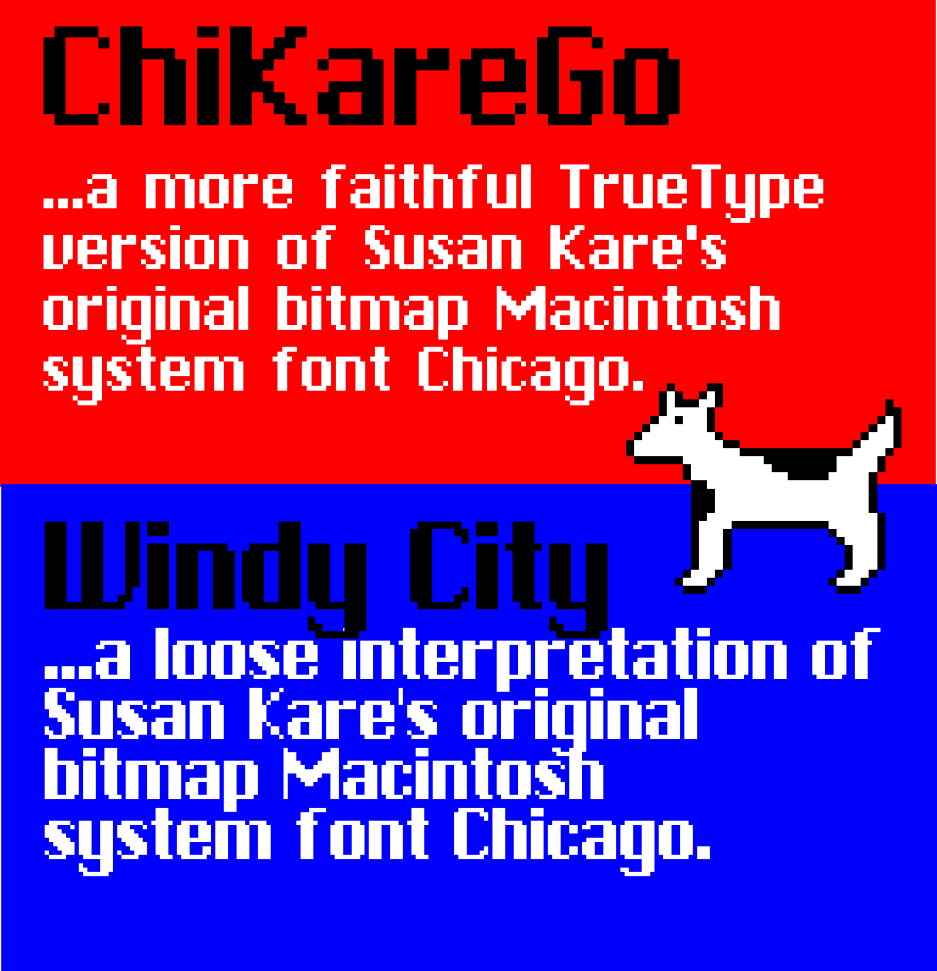
 I’m a huge fan of Susan Kare’s work – she designed the beautiful fonts and icons on the original 1984 Macintosh computer, a real work of art. I am always telling my students about this. They probably think I am a little crazed, but I genuinely don’t think a computer GUI has ever been more elegant with so few pixels. Sometimes less really is more.
Anyway, I got sidetracked today making some of my own versions of her original Mac system font Chicago – the first version I did was a loose interpretation which I call Windy City – it’s bigger and thicker than the real deal and is more like my own Bauhaus font.
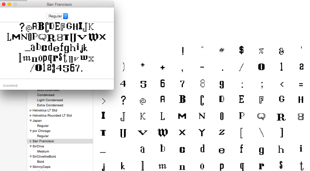
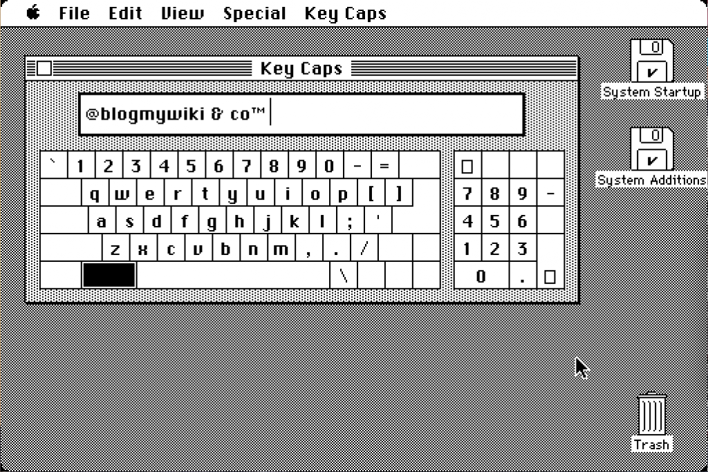
I then made a pixel-by-pixel copy of the real Chicago. The letters and numbers are precisely faithful to the original, but the punctuation is largely guesswork. I managed to open some 68k Mac system fonts today – including the ransom-note style San Francisco – but I could not get the bitmap version of Chicago to open in anything. More recent TrueType versions are no good for this.
You can download ChiKareGo here and Windy City here. They were both made with the totally awesome BitFontMaker2.
UPDATE
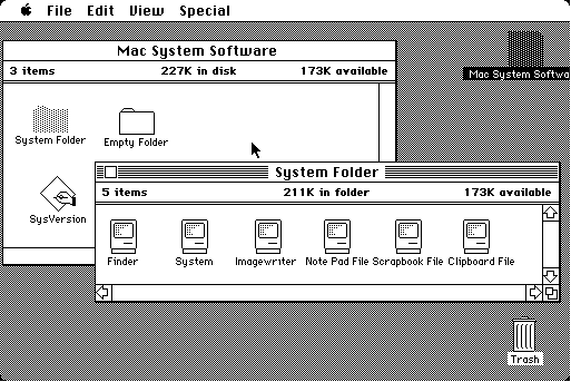
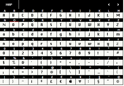
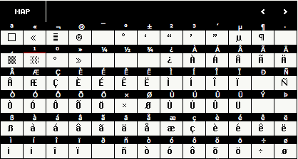
I’ve now made an even better version of ChiKareGo called ChiKareGo2 – more faithful to the original Chicago font because I have been able to look at the symbols and extended characters in a 68k Mac emulator. I’ve also made the letter spacing 2 pixels instead of 1 to make it look more like the original Macintosh screen (although the original Mac seems to have used kerning! Sometimes it puts 1 pixel space between letters, sometimes 2.) I’ve also included some stripes, a dialogue box close square, 2 shades of shading and even an Apple logo – oddly this seems to be missing from the original Chicago font!
I’m now going crazy trying to work out what the font was on the labels of icons in the Finder – it doesn’t seem to be quite Monaco nor Geneva and I can’t find any reference to it anywhere… my next project is to recreate it…
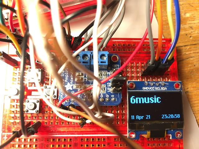
Examples of ChiKareGo in use
Tide time display using a Pimoroni InkyPHAT e-ink display on a Raspberry Pi:
Radio screen on an OLED display / Raspberry Pi:
Retro Mac watch face for the BangleJS smart watch:




The default font for the finder was 9-point Geneva in system 7, and could be customized. Go to the “Views” control panel and you can set the font for the finder. I looked closely at system 6, and it appears to be the same font. However, the finder font couldn’t be changed in system 6. https://en.wikipedia.org/wiki/Fonts_on_Macintosh
If you wish to check this, you can find an old Mac running system 7, or run the system 7.0.1 emulator on archive.org and open up the views control panel.
Really enjoying your site, BTW. Since you’re into old Mac stuff, I’d love to know if you have access to any memorabilia with Clarus the Dogcow on it.
Hi Matthew – glad you like the site and thank you for the info on the system fonts. I used to have a child’s T-shirt with Clarus on that I probably bought from Susan Kare 15 plus years ago, no idea what happened to it!
Note: ChiKareGo2 ‘s uppercase N, uppercase Ñ, and lowercase z are messed up and inconsistent with Kare’s original bitmap Chicago.
Also, the F is slightly wider on ChiKareGo2 than the actual system font.
Hi! Where can I get the bitmap version of San Francisco like the one in your screenshot? I found a smooth remake here: http://www.fontspace.com/hank-gillette/st-francis, which is great, but you know…
I think I got San Fransisco from a downloaded 68k Mac ROM or OS system image but as I recall I didn’t work on a modern Mac as the letters were all shifted. If you find a modern version bitmap of it I’d love to know!
Thanks! I’ll let you know if I ever find it. I just found the FFIL file from a converted disc image, but alas it doesn’t work.
OK, I just did this: https://www.dropbox.com/s/2fponfnmqlmpzxs/FranSanDisco.ttf?dl=0
But I didn’t make it to the numbers. :)
Very cool!
Will you make a version complete with the numbers pretty please?
You inspired me to make my own recreation of Geneva so I could recreate some old Hypercard-y feel: http://www.pentacom.jp/pentacom/bitfontmaker2/gallery/?id=5892 (I couldn’t find a way to kern specific letters, which was kind of a bummer– but SUCH a cool & intuitive tool.) Rock-rock on!
I’m currently coding a website about Susan Kare for a class project and I’m so excited to have found this page and your beautiful fonts! Your work is so appreciated and I’m excited to be able to use a rendition of her font!